

Energy Sports, Online
Designing an e-commerce site for a local sports shop
Project Type: Concept | Team: Solo, with group discovery | Duration: 1 Week | Role: UX Researcher & UX Designer
The Brief
'Energy Sports’ is a local sports store, based in Pimlico, London. They focus on great customer service, a curated range of trusted products and competitive pricing. With more and more people buying online, they want to offer their service online.
-
Create and deliver a clickable mid-fidelity prototype.
-
The initial research phase will be carried out as a group.
-
Analysis and insights, along with the subsequent phases, will be completed and presented back individually.
My Role: UX research, competitive analysis, screener survey, user interviews, insights, persona creation, empathy mapping, problem statement, design studio, feature prioritisation, sketching, low-fidelity and mid-fidelity wireframing, mid-fidelity prototyping, usability testing
Tools Used: Pen, Paper, Sketch, Trello, Miro, Google G-Suite, Zoom & Slack

Card Sorting of products into categories
Affinity Mapping for Menu Information Architecture
Direct Competitor Analysis
Jo's Persona
My Process
Discover
Competitors & Pain-Points
To understand the online sports market we conducted a competitive analysis as a group. We focused on the services offered by four large direct competitors, as well as local running shop.
To understand users pain-points we conducted 6 user interviews to understand the sports they did, where they bought their equipment and what types of items they preferred to buy in a sports shop.
We had been given a list of 41 products stocked by Energy Sports, we conducted 15 open and closed card-sorts on the Trello platform to see how they grouped items. Finally, individually, we carried out affinity mapping to identify a potential menu structure for the new site.
Challenge:
-
For items where the sizing wasn't critical, most users would order online both for convenience and price.
-
Returning items that didn't fit was a major pain-point.
Opportunity:
-
For sports footwear, where fit is critical, the majority preferred to go into a shop to test fit before purchasing.
-
Keeping the site simple, with clear guidance on sizing would be a major draw for customers.
Develop
Ideate & Iterate
To meet Jo's requirement, I considered and created a simple user flow, her 'happy path', and identified the potential site map required to meet it.
Additionally, in order to satisfy Energy Sports requirement, I incorporated 'About Us' and 'Advice & Contact Us' features.
Initially, I sketched the screens to meet the happy path and tested these with 2 users. They understood the core steps, as the site followed their expected mental model for an e-commerce site, but were confused by the 'True Size' concept.
Repeating the testing once the low-fidelity wireframes had been created in sketch also hit problems at the same point.
Findings:
-
Users were able to recall their mental model when testing on low-fidelity wireframes.
-
Most screens worked as anticipated.
-
Having multiple routes to find a product was beneficial.
-
Users didn't understand True Size, but when explained, like the concept.
Having ideated on True Size and considered an additional feature to reinforce this site was for a local shop, I created the mid-fidelity wireframes.
Define
The User's Challenege
The research identified running as the most popular sport, and also the one with the biggest pain-point, sizing. With this in mind, I created a persona, Jo, who was planning to run her first marathon and needed new perfect fitting running shoes.
The additional challenge for Jo was she wanted the shoes today, ready to pick up after work, without having to queue.
Opportunity:
-
Creating a unique 'True Size' feature that, given information about the user's existing well-fitting shoes, would recommend perfect fitting alternatives.
Challenge:
-
How to present the True Size interaction to be intuitive.
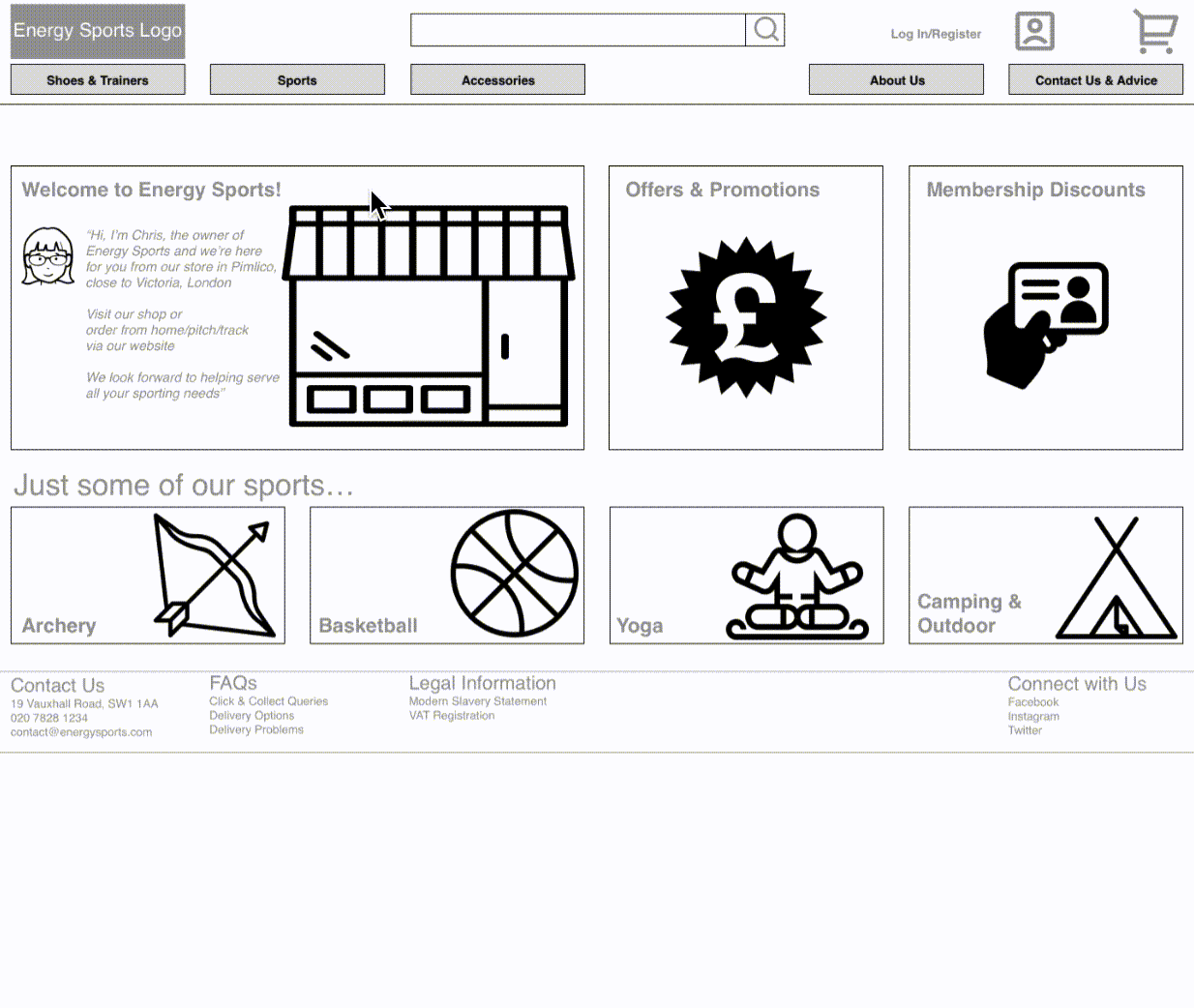
Deliver
The Prototype
The mid-fidelity prototype, with particular focus on the new True Size concept, was tested with 3 users.
User Feedback:
-
'I like the simplicity of the graphics.'
-
The pages had more space so didn't feel so crowded.
-
The filters were clear and easy to use.
-
'Ah, True Size is a really cool feature'.
Finally, 'True Size' worked! If it can be set up with the right information, it would give reassurance of buying running shoes online and reduce the hassle of returns.

Top: Original 'True size' concept. Bottom: Redesigned concept
Conclusion
To Improve
Next Steps
While testers liked the True Size concept, I would look to iterate the mid-fidelity wireframes to a high-fidelity prototype, focusing on:
-
How the True Size feature could work in reality.
-
Improving the checkout process, including how the checkout proceed-to-next-step and back buttons should be presented and positioned.
-
Review the spacing on the product page to further clarify the importance of customer reviews while improving the clarity of the happy path.
-
Conduct more ‘real world’ interviews to validate the wireframes, but also to identify potential features that would increase return visits to the site.
What I Learnt
Keep Iterating
-
This was my first project using Sketch and InVision, and I now feel I have a great foundation to develop these skills further.
-
I’m beginning to really understand the importance and power of giving the user interface plenty of room to ‘breathe’, making it easier to use and aesthetically more pleasing.
-
Fundamentally, from my experience with the ‘True Size’ concept, I’m not scared to try out new ideas to solve a user’s problem, but I need to be very open to user feedback to iterate the concept, particularly where it’s a novel idea that the user hasn’t encountered before.
Feedback
My Experience
-
I found this project challenging as I initially found Sketch and InVision confusing, but with the experience and support of the group, I was able to develop a good foundation for future projects.
-
Having worked in retail IT previously, and as a major user of online platforms, I found it fascinating that the 'online shop' mental model is so ingrained that users were able to navigate a very simple wireframe, even though it was just a mixture of lines and boxes.
-
It also made me consider the importance of clear onboarding when new features are introduced that may, in the short term, challenge that model.
Prototype: Finding & purchasing the right size of over-pronated shoe